Books and Illustrations
February 6, 2018
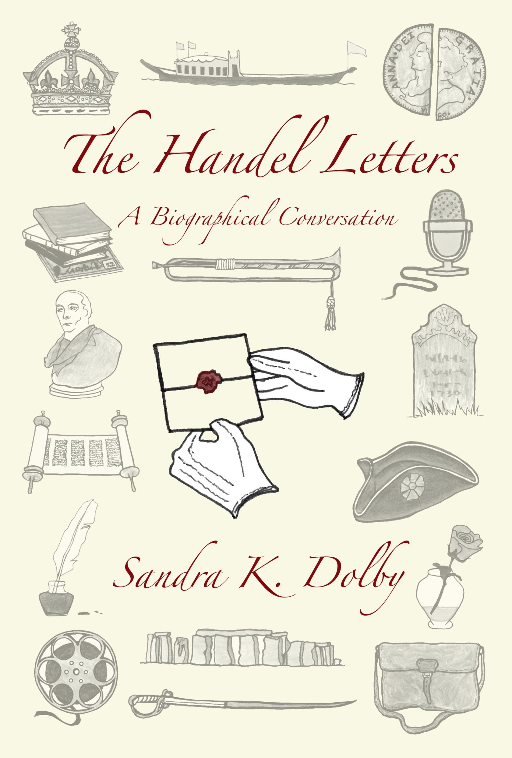
I will guess that the first thing you will notice about The Handel Letters: A Biographical Conversation is the cover. I opted for the matte finish paperback cover, and I am glad I did. It feels and looks good—a good choice, I think. CreateSpace has various templates for covers, and Mr. Humphrey, in his CreateSpace for Beginners, discusses these templates, admitting that he uses them 95% of the time. Such cookie cutter covers were one thing I really wanted to avoid in creating my book, so I chose to ask my daughter, Alexis Stahl, to create the cover and upload it to the CreateSpace site. This was one of the last things done before giving CreateSpace the go-ahead for publishing, but as the cover is likely the first thing readers will see, let me comment on it here.

Alexis Stahl has a BA in Art from Tulane University (Newcomb College) and an MFA in Art from the University of Cincinnati. Files for the front, back, and spine of the Handel book were hers to design and adapt to the required sections and pages on CreateSpace’s website. Of course, she ran everything by me beforehand, but I was so glad to turn that task over to her. Quite aside from the technical skills involved in uploading the files correctly, her real challenge was in creating the drawings that would serve as chapter head illustrations and as images arranged on the cover of the book. Using some of the pictures from the book interior on the cover was her idea, and I think it was an excellent one.
I will talk another time about some of the individual chapter head illustrations, but for now I want to draw your attention to how she created a pleasing and meaningful collage as a front cover. There needed to be a certain amount of symmetry, with images of similar shape and size lined up on either side and down the middle. In the middle there are long, horizontal figures, and on either side there are images of roughly similar shape and size included opposite each other. Prominent, in the center, and in bolder print, is a thematically important drawing of a pair of white- gloved hands holding an old-fashioned sealed letter. The seal is in red and matches the only other red-colored writing on the cover—the title and author’s name. Against a cream-colored background, all of the grey-toned drawings suggest ideas to be found in the book and simultaneously create a pleasing picture in and of themselves. I applaud Alexis on creating a unique and attractive cover.
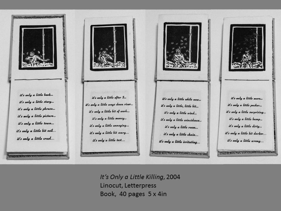
You might wonder what kind of art background would be influential in leading to the cover Alexis created. I am pretty sure much of the creativity that went into creating the cover is simply part of my daughter’s natural talent coming to the fore—no undue maternal pride there, right? However, you will find it interesting, no doubt, to know that her specialization in studying art was in printmaking. I have nearly twenty of her prints of various sorts—abstract, realistic, or thematic—framed and displayed upon my walls. But I have one of her artworks that clearly underscores the skill and aesthetic perspective necessary for creating the cover of the Handel book. And that is a small hand-made book Alexis created some few years ago—a hand-stitched book, 4.5 inches by 8.5 inches, with a black cloth cover and marbled inside and end papers. She agreed to let me share with you a page from the book, but please do respect her ownership of the image. It is, after all, part of a larger unique piece of art. Here is the page I’ve chosen to share:
I plan to write more about book illustrations next time and to consider the genre or category that seems most appropriate for The Handel Letters. Meanwhile, thank you for dropping by.